Graphing the Relationship
So do the planets really follow this formula? We can observe how fast the planets are going in km/s, and we can measure their average distance from the sun. The distance from the sun is given in AU, or astronomical units (1 AU is the distance from the Earth to the sun; that's why Earth's distance is exactly 1). First, try to graph the following data on a sheet of paper. Then, see if you can find a best fit line for the data below. Your calculator or Excel should have a "power" fit that will match the data nicely.
Distance (AU) |
Velocity (km/s) |
|
|---|---|---|
| Mercury | .383 |
47.4 |
| Venus | .723 |
35.0 |
| Earth | 1.00 |
29.8 |
| Mars | 1.52 |
24.1 |
| Jupiter | 5.20 |
13.1 |
| Saturn | 9.53 |
9.64 |
| Uranus | 19.2 |
6.80 |
| Neptune | 30.1 |
5.43 |
| Pluto | 39.5 |
4.67 |
Solution
Using Excel, we might get a graph like this:
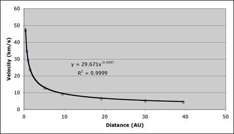
The data correspond almost perfectly to a curve, and not just any curve, but r-1/2 -- the same power of r we expected from Newton's Law. Our prediction was spot on for the solar system. Even lowly Pluto, which has a highly irregular orbit compared to the planets, follows the trend.